In today’s digital age, mobile devices have become an integral part of our daily lives. From smartphones to tablets, people rely on these devices for various tasks, including browsing the internet. As a result, having a mobile-friendly website has become a necessity for businesses and organizations.
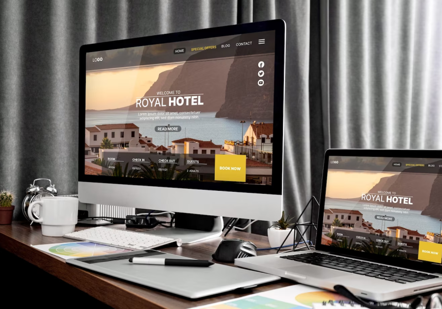
Responsive web design is the solution to ensuring that your website looks and functions seamlessly across all screen sizes and devices. In this blog post, we will explore why responsive design is essential in the modern digital landscape.

The Mobile-First World
It’s no secret that mobile usage has skyrocketed in recent years. In fact, more people now access the internet via mobile devices than desktop computers. This shift in user behavior has significant implications for website owners.
If your website is not optimized for mobile, you risk alienating a large portion of your audience. Visitors who have to pinch, zoom, and scroll excessively to navigate your site are likely to become frustrated and leave. On the other hand, a responsive website adapts to the user’s device, providing a smooth and enjoyable experience.
Improved User Experience
User experience (UX) plays a crucial role in the success of any website. When users encounter a site that is easy to navigate, loads quickly, and provides valuable content, they are more likely to stay engaged and return in the future.
Responsive design enhances UX by ensuring that your website functions optimally on all devices. Users can access your content without disruption, resulting in longer visit durations and lower bounce rates. This positive experience fosters trust and credibility, which are essential for converting visitors into customers.
SEO Benefits
Search engines, like Google, consider mobile-friendliness as a ranking factor. Websites that are responsive and provide a seamless mobile experience are more likely to appear higher in search engine results pages (SERPs). This means that investing in responsive design can positively impact your website’s visibility and organic traffic.
Cost-Effective Solution
In the past, businesses often maintained separate desktop and mobile versions of their websites. Not only was this approach costly to develop and maintain, but it also created challenges in terms of content consistency. With responsive design, you have a single website that adapts to various devices, reducing development and maintenance costs.
Future-Proofing Your Website
Technology continues to evolve, and new devices with varying screen sizes are regularly introduced to the market. Responsive design is a forward-thinking approach that future-proofs your website. By embracing this design philosophy, you ensure that your site remains accessible and engaging for users, regardless of the devices they use.
Conclusion
In a mobile-first world, responsive design is not an option but a necessity. It enhances user experience, positively impacts SEO, and offers a cost-effective solution for businesses. Moreover, it future-proofs your website, ensuring its relevance in an ever-evolving digital landscape. If your website is not yet responsive, now is the time to make the transition and stay ahead in the online race.